It turns out that people want to know when they’re surviving a Long Winter of their own.
My research into the weather and climate of Laura Ingalls Wilder’s books has many facets. I have focused extensively on The Long Winter, while dabbling in the events of other books and other parts of Laura’s life. One of the big questions about the Long Winter of Laura’s experience was to answer this seemingly simple question: How bad was it, and was it the worst winter on record?
To answer that, we have to be able to define “bad”. A hard winter would have to be longer than usual, snowier than usual, and colder than usual. It could be windier than usual, too, and maybe even have some ice mixed in with the snow. Somehow, we have to take as many elements of a hard winter as possible, then wrap them up together into one convenient measurement and package it in a way that’s easy to understand. It would have to be measurable, too, and not just opinion; in science, we call that “objective” when it’s measurable, as opposed to “subjective” when it’s open to interpretation.
No such measurement existed. If I wanted to answer that question, I’d have to create the index that lets me answer it.
I found a colleague who was interested in this question, too. Steve Hilberg, a climatologist and former director of the Midwestern Regional Climate Center, is a winter weather enthusiast who had been dabbling in his own winter index. My graduate advisors steered me toward him as a possible resource of information. We had a great conversation at a meeting of climatologists back in 2011, and we decided to join forces, put our best ideas together, and work together make this index real.
It’s a complicated problem. We had to define what it means for winter to start and stop. We had to figure out how to weigh big snows and sharply colder air, compared to the more mundane. We had to figure out how to show that what counts as a severe winter in Minneapolis is very different from what’s severe in Atlanta, and the index had to work in both places. We spent hundreds of hours refining formulas, testing sites, tweaking spreadsheets, and repeating the process. We presented it to different conferences of our peers to get their feedback and ideas and to test their enthusiasm for its potential. Science never progresses with a steady ramp upward from problem to solution; it’s done in fits and starts, with bursts of work and weeks of quiet, with big progress and small setbacks.
We dubbed it the Accumulated Winter Season Severity Index (or AWSSI, pronounced to rhyme with “bossy”).
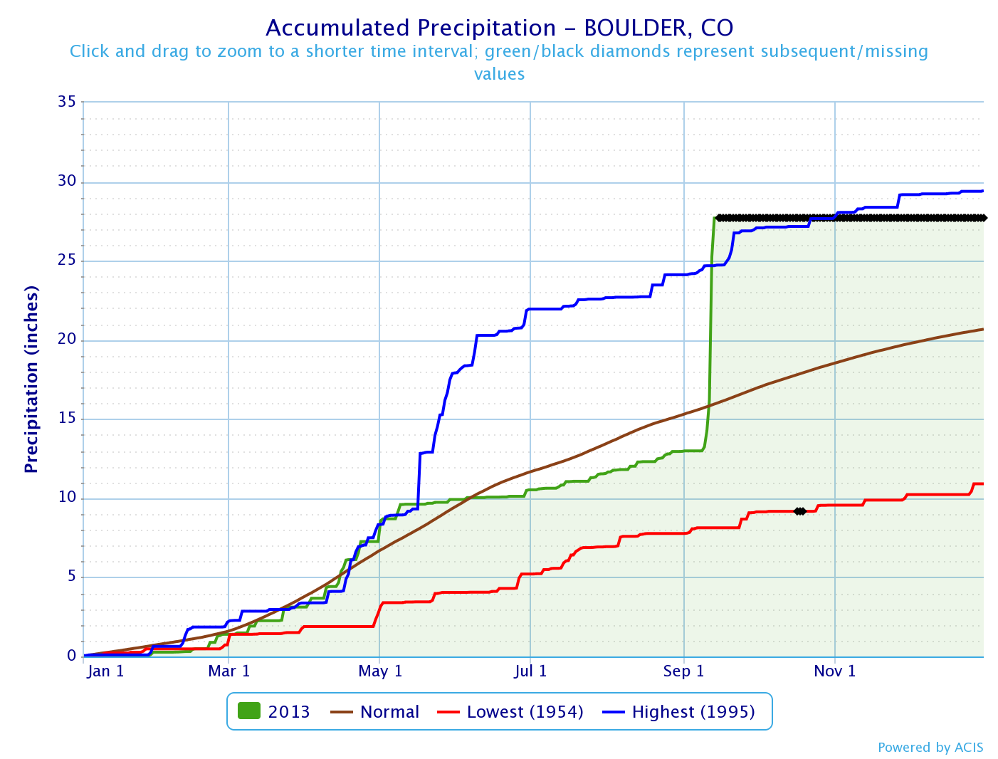
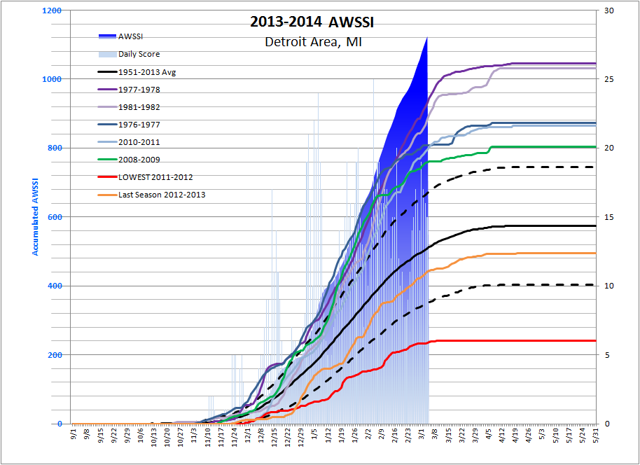
We use high and low temperatures, snowfall, and snow depth, assigning points based on thresholds of each of those numbers. (Nobody has good records of icing, so we couldn’t include it in the index. And wind information is both hard to find and hard to use, so we decided to leave it out of the index, too.) We looked at a period from 1950-51 through 2012-13, when snow records are most reliable at the most sites.
Finally, in the fall of 2013, we landed on a formulation that we liked, and we started running a bunch of sites around the U.S. through the calculations. It was and is a tedious, labor-intensive process, but it was a labor of love and devotion to demonstrate the utility of the AWSSI. We proudly exchanged our calculations with each other and started to show a few colleagues and coworkers. The index was working! It was showing us how severe a winter is as it is happening, and it was letting us compare this winter to the previous winters at the same location. It was letting us compare the severity of the winter at sites like Detroit and Chicago.
And the winter kept on coming, and the AWSSI kept on ticking. Through about mid-January, in most locations, there is not a lot of separation between the extreme winters and the mild ones. But by around mid-January, a severe to extreme winter can start to pull away from the pack. Omaha’s winter actually got closer to the middle of the pack in that time. But in places like Chicago, Detroit, and Urbana, the winter started to pull ahead. Running the AWSSI every few mornings was like opening a little present for us — we were that excited to see the results!
Somewhere, from a colleague to a friend, one media person on a public radio station in Chicago heard that we were able to track a winter’s severity, and he got interested. He ran a little web story on it, and we thought that was pretty neat. Then a public radio station in Michigan heard about it and wanted to have a little radio story of their own. An esteemed colleague in the media, Andrew Freedman, picked up on the story and ran a longer feature in Mashable, and that drew the attention of the Associated Press. When the AP ran its story, the AWSSI went viral, with stories running in national papers from USAToday to Yahoo to Time to NBC News, as well as in countless local papers. Steve and I managed dozens of press inquiries. I even got to be on CNN! We’re still getting inquiries about the index and how it’s stacking up this year’s winter against the others. And I’m even getting the occasional Laura-related inquiry, too, which always makes me smile and skip around a little bit!
And all because I wanted to know how bad Laura’s winter really was.

Steve and I are working on the last piece of the research that will let us answer that question. The index right now uses temperature and snow data, but snow data doesn’t go back into the 1800s in most places. So, we need to come up with a way to use temperature and precipitation (the melted-down equivalent of whatever fell out of the sky) instead, and calculate an estimate of snow. It’s a little tricky to do that, and there is no perfect method. But if we can at least get a consistent method (and we’re really pretty much there!), then I can run it on the sites that were near De Smet during the Long Winter. I can see how high the AWSSI goes, compare it to what we know of AWSSI in those surrounding sites, and determine once and for all, mathematically correctly, if the Long Winter really was the worst winter since white settlers arrived in the region.
We are *this* close to answering my original question! Stay tuned!
In the meantime, this is what an extreme winter looks like, at least in Detroit through March 5 (below). The blue shaded curve is this year’s accumulation, and the faint blue bars are each day’s contribution. The thick black line is the average, and the dashed black lines on either side are the most common 67% of years. The other lines include last year’s accumulation, the mildest winter, and the 5 most extreme winters (before this year).
For those of you stuck in the hardest-hit areas this winter, remember that even the Long Winter ended! The grass grew again, the snow piles melted, the waters thawed, and spring and summer came. You’re nearly there!
“It can’t beat us!” Pa said.
“Can’t it, Pa?” Laura asked stupidly.
“No,” said Pa. “It’s got to quit sometime and we don’t. It can’t lick us. We won’t give up.”
Then Laura felt a warmth inside her. It was very small but it was strong. It was steady, like a tiny light in the dark, and it burned very low but no winds could make it flicker because it would not give up.


 e me books that had a happy ending, which GWTW certainly does not! This was, however, the first real adult-themed book that I read (I picked it up in 8th grade off one of those old book order sheets that we used to get). The book taught me much about making mistakes, seeing people around me (how could Scarlett not see how much Rhett loved her?!), appreciating what I have, and understanding the foundations of racism from a much different perspective than my upbringing in Yankee territory.
 3. The Grapes of Wrath (John Steinbeck). Steinbeck swept me away to a place and time that was so, so much harder than anything I could imagine. His literary tools, interspersing the Joad family story with more broad descriptions of the Okies in the Dust Bowl era, really resonated with me. The book taught me about seeing people instead of their situations. It also introduced me to the human side of the Dust Bowl.
 d of the Blue Dolphins (Scott O’Dell). Something about Karana, a native Nicoleño Indian marooned on San Nicolas Island (off the California Coast) learning how to not only stay alive but also tame wild beasts and also find time for beauty, made me feel her strength and elegance. Plus, I’m a sucker for stories based in truth, though what happened to her after she was rescued definitely did not make for a happy ending.
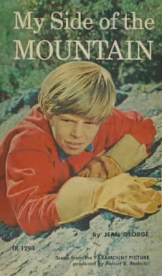 hemes in this story, but with a little boy in the New York woods instead of a girl in the Pacific islands. Everything from the cool survival tools to the relationship with the animals (especially his peregrine falcon) struck me. Unlike the book above, this work is fictional, but its setting was more familiar to me… familiar enough that I could replicate trying to fit into the hollow of a tree or live off the land.